A New User Interface Concept for ATM’s to Reduce Receipt Wastage
Duration
2021 Jan - 2021 Aug
Sector
Urban Development
My Role
UI/UX Designer
Project Goals and Objectives
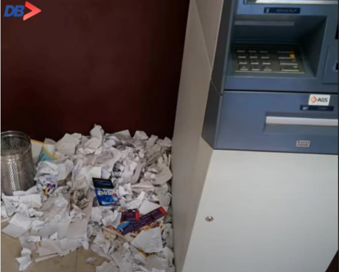
We've all used ATMs at some point in our lives. Most of the time, we find that the garbage cans at ATM locations are overflowing with meaningless receipts that consumers have requested. That is what inspired me to work on this design project. The objective of this project is to reduce receipt wastage at ATMs by designing a new user interface that would limit the amount of unnecessary receipts issued.
Process Followed
Research
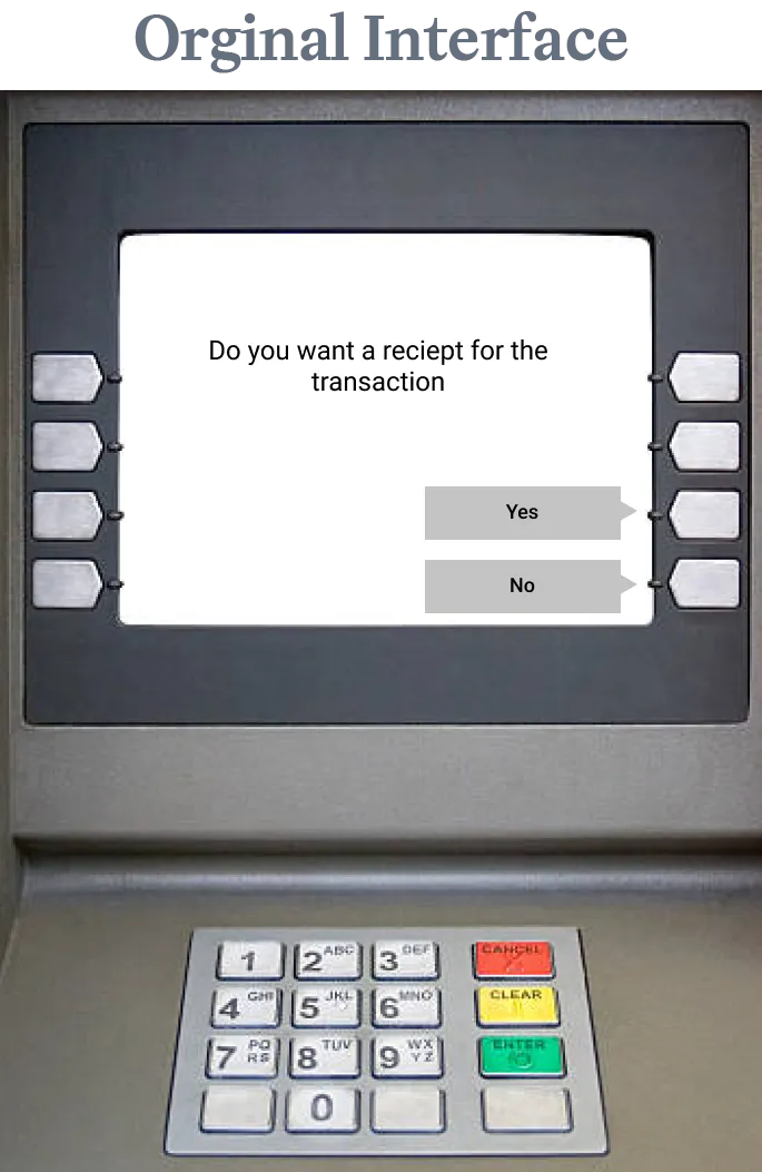
First, I conducted research to understand why people are printing excess receipts, even when they don not need them. This search lead to a research done by the University of Sussex, where it mentioned that the typical questions like 'Do you want a receipt?' YES/NO are susceptible to acquiescence bias, which is a cognitive bias that causes people to answer 'yes' to questions that they would not have answered 'yes' to if they were not asked. This is because people tend to avoid saying 'no' to requests, even if they don't want to.
Solution Design
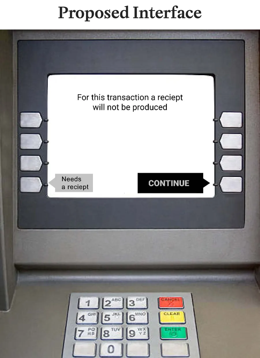
After the research, I designed a new user interface to avoid acquiescence bias. The new interface would be in the default state of receipt is not issued, and the user would only be able to request a receipt if they explicitly choose to do so, by making use Fitts' and von Restroff's laws. You can view the solution below.
User Testing
After the solution design, I wanted to test the design. But with the Covid pandemic and tighter regulations within banks, I was not able to run a mock version of our solution on an actual ATM machine. Instead, I created a web-based simulation in order to collect data on user behavior. Although the web simulation does not actually “print” a receipt and the user might be biased by this information, but we can assume this bias affects both original and new interfaces equally. Hence given the circumstances, the results of the web simulation are still valid.
In the test every user who visits the website will get the same set of interfaces in the same order similar to a regular ATM transaction, except for the new interface, a user has a 50% probability of seeing either the proposed new interface or the original interface. Also several restrictions were done to make sure a user completed the test only once.
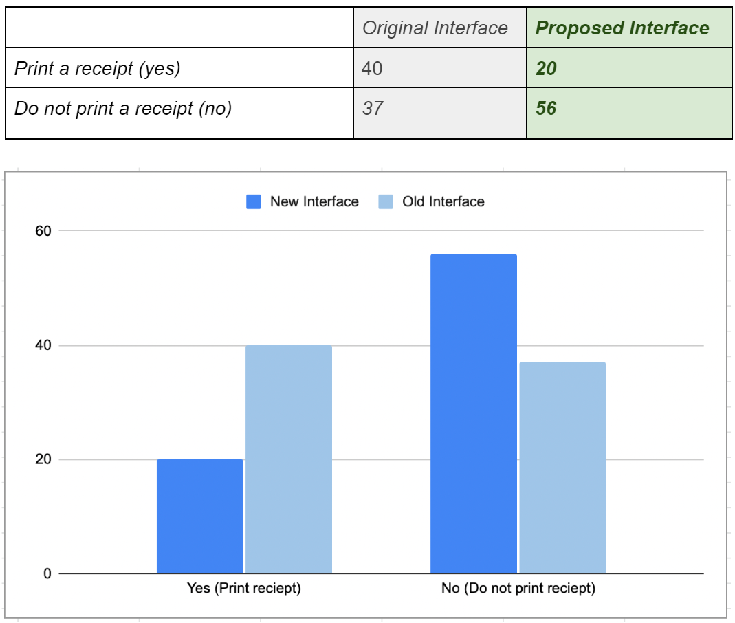
153 users participated in the test, and you can view the test from below. The results show that 52% of users who encountered the original interface requested a receipt whereas only 26% of the users who encountered the new interface did the same. This means that 74% of the users rejected receipt in the new interface. This is a significant improvement from the original interface.
Outcome
With the above result we can conclude that the proposed solution is effective in reducing the number of users requesting receipts. This is because the new interface is designed to avoid acquiescence bias by making the receipt request an explicit action. Also this solution cost-effective and sustainable compared to alternatives like `SMS receipts` and `Email receipts`. More details about this can be found in the presentation below.
Accomplishments
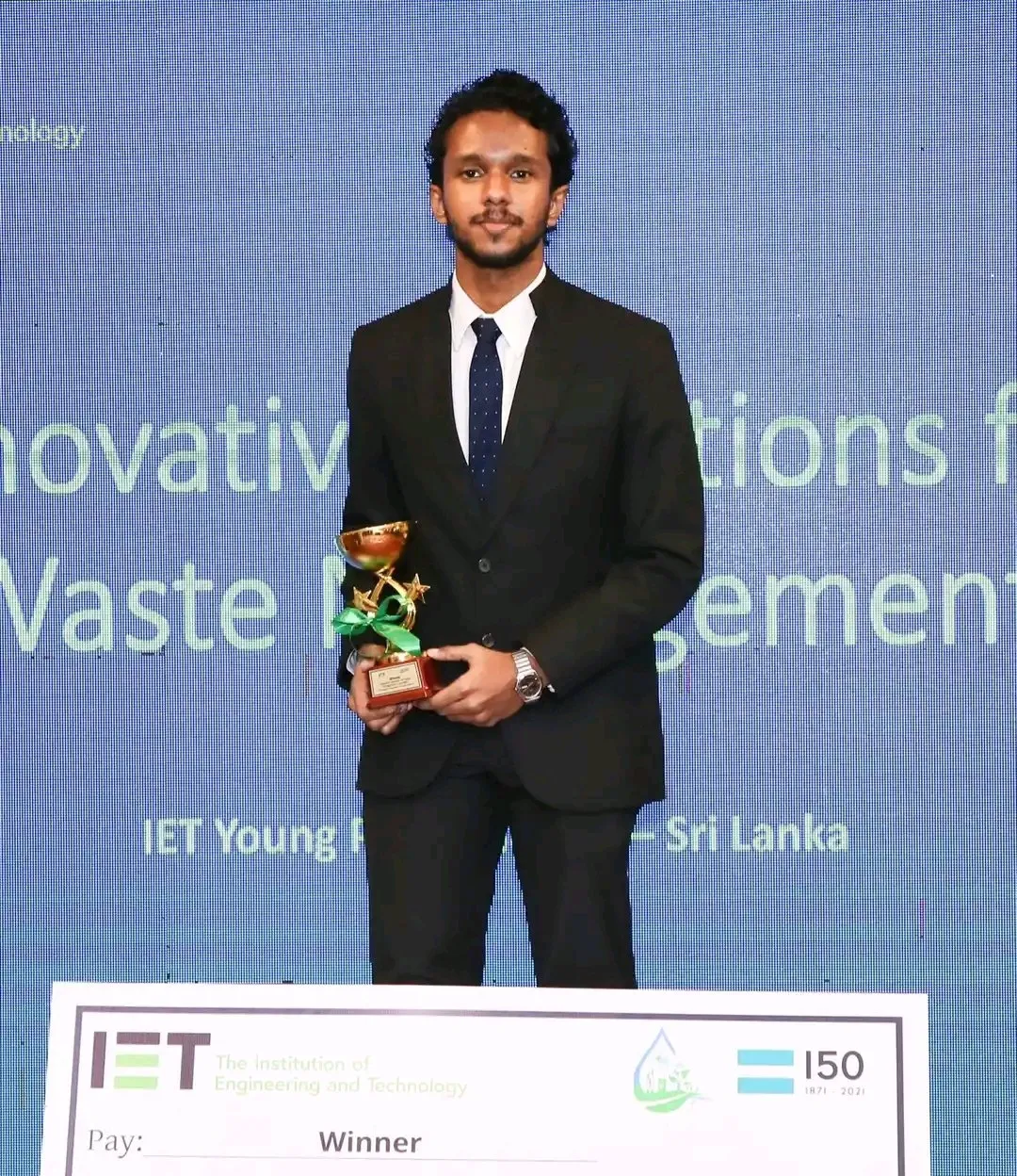
I competed in two competitions: the 'Stanford Design Challenge' organized by the Stanford University in the United States and the 'IET 150 & Beyond' hosted by the Sri Lankan IET Young Professionals chapter. Despite failing to reach the finals of the first competition, I was able to win the second competition by successfully utilizing the feedback I received.
View Presentation
The presentation that follows goes into great detail regarding the project. For further information, you can refer to this presentation.
